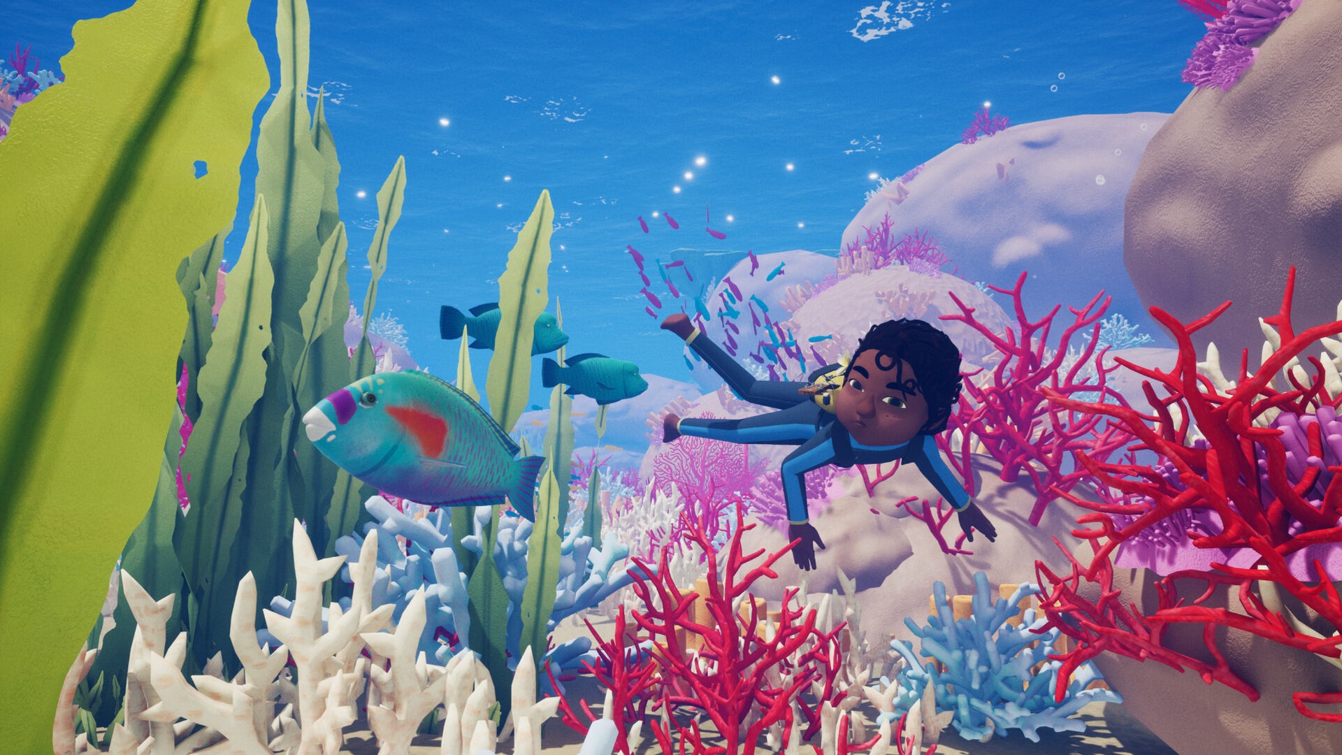
Starting Tchia is an experience. The music starts, you realise the entire game is voiced in French and Drehu, and you know it’s a game built on passion. If you’re like me, however, starting Tchia also involves encountering the unreadable text in its options menus.
It’s unfair to single Tchia out. It offers a wealth of accessibility options. But it also represents the most recent example of a growing trend in video game UI, in which text is becoming smaller and less legible.
To understand why this is happening, and explore possible solutions, I spoke to accessibility consultant Ian Hamilton and lead designer of typeface studio Lettermatic, Riley Cran.
“Miniscule text is by far the most common accessibility complaint,” Hamilton tells me via email.
For instance, Hamilton says, “For someone with full 20/20 vision on a typical screen in a typical living room viewing environment, text needs to be in the region of at least 28px at 1080p.”
But reading isn’t an objective experience. 28px may be readable for sighted players, but visually impaired gamers may need text to be much larger. For this reason, Cran tells me via email, “typography should be adjustable, simply to cater to as many of those experiences as it can.”
You may think this makes the answer as simple as making text bigger – and, to a point, it does. But changing text size, weight, tracking, or leading has major ramifications for UI. Interface elements designed around small text can’t necessarily be scaled up for larger or bolder text without affecting the balance of the UI.
